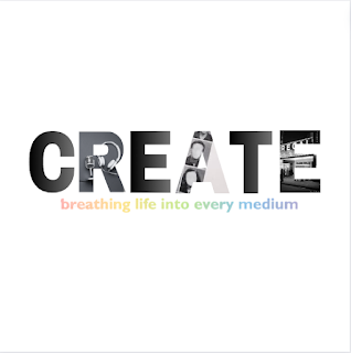
I believe this version of our logo perfectly maximized both our hopes to achieve an aesthetically pleasing theme and to incorporate color theory in order to symbolize creativity. The rainbow-style text, mirroring Abstract's design, excellently encompasses the principle that media creation and engagement spawns livelihood and beauty, an overarching purpose of our documentary series.
Moreover, as we prepare to initiate our social media component, Lauren and I have discussed making our final logo as the profile picture for our Instagram account, a platform we deemed optimal given our target audience ranges the ages 18 to 25 and includes both female and male viewers. In addition, in honor of our title, we also concluded that merely naming our account "createdocu" would be an easy and simple manner to indicate to audiences what the account entails as it represents both the label and form of media text of the piece. Here is a sneak peek at the introduction of our profile:
P.S: Filming process is nearly concluded (updates coming soon👀😄✌).


No comments:
Post a Comment