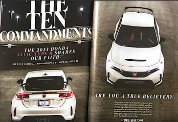
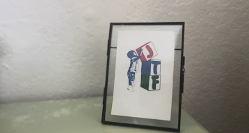
This week, while in class, Lauren and I began our research by viewing the magazines our teacher owned, ranging from People to Car and Driver. As we flipped through the pages, we noted and scanned any details or layouts we found interesting or engaging that we could possibly mirror on our own design. Below are some of the compositions I personally felt inspired by and why.
-People and Forbes:

The layouts above (taken from People Magazine and Forbes, respectively) both include a column in which fun facts regarding the topic of the article are mentioned, a fun and engaging detail that entices the audience in a way plausible for Lauren and I to mimic. I specifically noted the placement of the sections in the middle of the page, a structural component which perfectly adds an eye-catching element to the page.
In addition, the People text on the left, a piece on the actress Michelle Yeoh, is written in the style of an interview, with questions and dialogue italicized for readers to follow clearly. When learning about the different options of magazine texts we could create, interviews were mentioned; however Lauren and I were unsure of the option. Yet, following my reading of the People extract, I feel confident that such a model would be extremely fitting for the documentary article as an interview could provide detailed insight on the production decisions and overall meaning of the work from the eyes of the "director."
-Car and Driver:
-People (again):
The layout illustrated, also from the Michelle Yeoh People article, includes a minor and yet crucial design aspect that I greatly believe would benefit our project. As may be seen, in between the paragraphs, three small dots are elicited dividing the content and sections of the interview being described. In addition, the dots are all different colors, an adorable and fun decision which perfectly encapsulates People Magazine's exciting aura. Drawing from this, I feel that Lauren and I should include a similar divisional structure which mirrors the rainbow aesthetic incorporated in our documentary logo. In addition, toward the bottom of the page, a quote by the actress is accentuated, a detail Lauren and I agreed increases the intimacy and amusement of an article and are now dedicated to including in our own piece.
I would like to personally thank People Magazine for providing Lauren and I with so much inspiration for this aspect of the portfolio project (People, if you're reading this, please give me a job in the future). Now, with my gained familiarity on the genre, although seemingly impossible, I am even more excited to write the magazine article for Create. Also, thank you to TStok for all the magazines.


No comments:
Post a Comment