Wednesday, April 10, 2024

Critical Reflection

It's critical reflection time! Below is my extremely long CR essay discussing my overall experience creating this portfolio along with the accomplishments I believe my project achieved and the facets in which it could have improved.

          The episodic documentary Create: Breathing Life into Every Medium strives to represent one primary theme: The brilliance and variety of media-creation in all its different mediums. Through the depiction of 5 subjects, Constanza, Josh, Sai, Riley, and Abby, the piece encompasses the dedication and the specified techniques that surround media creation in all its separate forms, thus exemplifying to audiences the beauty and importance of every media mode ranging from print to audio.

          Structured in a distinct manner, Create resembles a multitude of the conventions indicated in the existing documentary Abstract: The Art of Design, a piece my partner Lauren and I took vast inspiration from. Amidst brainstorming ideas, Lauren suggested what she titled “a documentary about a documentary,” a thought we eventually developed into a “documentary about media production as a whole.” Following our idea construction, Lauren and I were required to discover the structure of our episodic piece, a process which marked itself as an ultimate gateway for research and which led Lauren and I to Abstract. As a documentary about careers in the arts field, Abstract follows a separate subject, all with a distinct job, in each episode of its seasons, a structural model Lauren and I concluded would be optimal for Create as well, thus resulting in our documentary representing a different medium in each episode. Furthermore, considering the necessity for all of the contect used to be specifically created by Lauren and I, archived footage, a common documentary convention, was not an option for Create. Inspiringly, Abstract does a wonderful job of including staged b-roll within their episodes, depicting subjects pretending to do their tasks in replacement of incorporating photos from the past employments they discuss. Once more modeling our plans after the wonderful Netflix documentary, Lauren and I, in a way, both challenged and abided by documentary conventions with the disregard for archived footage and the simultaneous inclusion of staged b-roll depicting subjects in their duties. 

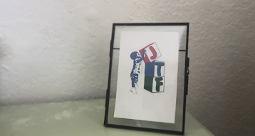
          In additional research, Lauren and I viewed separate pieces in order to widen our knowledge database for documentaries. Personally, I watched another Netflix piece, American Nightmare, to gain greater familiarity with staged b-roll while also noting a new technique: handheld cameras. While I am aware of what a handheld shot is, I felt that the manners in which I was accustomed to employing the technique merely appeared unprofessional. Understanding that handhelds are a major convention for documentaries, I concluded I needed to view examples. American Nightmare did a wonderful job of illustrating how a handheld shot may be incorporated in a documentary while maintaining the poise and elegance of the extract, despite the piece being the exact opposite of elegant; the mixture between steady and shaky included in a single shot, modeled by my partner and I through a handheld tripod instead, perfectly combined the humane aspects crucial to a documentary and the coherent, non-messy look necessary to translate a meaningful story effectively. Moreover, American Nightmare’s employment of staged b-roll, although the same technique, varied greatly from Abstract’s examples. While in Abstract the primary subjects were almost always included in the staged b-roll, American Nightmare did a wonderful job of recreating moments which were described in the interview that they, even the subject, had no access to, such as the conversations in a detective room, a strategy Lauren and I utilized for the 5 minute extract representing Sai and Josh. In the beginning of their interviews, Sai and Josh discuss the “Jason Taylor Foundation,” the official sponsor for their podcast, all discussions which did not include their presence and facts we did not have access to, such as the foundation’s creation of a podcast sector. Drawing from American Nightmare, Lauren and I got creative in the absence of the subjects and employed shots such as a printed Jason Taylor logo in a picture frame to represent Sai and Josh’s introduction of the sponsor. 

          Interestingly, the research pieces we viewed not only assisted Lauren and I in the visual creation of our portfolio project but also in the brand-developing aspect. Hoping to represent the true essence and nature of our documentary, Lauren and I concluded that the aesthetic we aimed for would need to translate a theme of creativity and art, an idea Abstract further assisted in developing. Abstract’s logo, specifically the title letters, are colored in a rainbow ombre shade that Lauren and I modeled Create’s tagline, ‘breathing life into every medium.’ Although the idea to color the tagline in a rainbow-like sequence originated from my classmate Yoav, who believed the colorful look would perfectly encompass the wide-range of media we hoped to represent as well as the creative mood we strived to translate, Abstract’s actual employment of the facet facilitated Lauren and I’s designing of the tagline, suggesting an ombre intra-letter appearance rather than an inter-letter, separate colors each look. 

          Extending the brand from the documentary piece, marked by the episode introductory logo, Lauren and I shaped both our social media and magazine article around the idea of a creative message as well. The Instagram page we formulated, which includes both images and videos, engulfs a variety of different templates that allowed us to translate the open-minded, imaginative message of the Create brand. For instance, on our “meet the subjects” posts, as opposed to merely posting images of the subjects with an introductory caption, Lauren and I strategically created layouts for the three posts, each including elements for the specified medium, such as audio waves for Josh and Sai, along with an ombre, colorful background to further extend the rainbow idea to all components. Concerning the magazine article, Lauren and I concluded our brand should be translated in increasingly covert manners, considering the article is supposed to be written by a third party interviewer. Consequently, the layout of the magazine primarily surrounds the color blue instead of the rainbow appearance as blue is a shade commonly associated with creativity and imagination. 


          Yet, in reflection, I thoroughly believe Lauren and I have room for improvement in our brand development, specifically regarding our social media page. While some posts are highly creative, such as the previously mentioned “meet the subjects” templates along with videos such as our blooper reel sequence, some other publications lacked much thought or imagination behind them. For instance, the behind the scenes post, which includes pictures from filming, merely encompasses a slideshow of images in a basic and unoriginal manner. Instead, I believe we could have employed another upbeat and imaginative template to illustrate the ‘BTS’ moments we hoped to share, thus further fortifying and extending the creativity aura important to Create’s branding. 

          Despite brand development flaws, Create’s Instagram page persevered and succeeded in engaging with the documentary’s target audience: High school students of both genders aged 14-19. Instagram is undoubtedly one of the most popular social media platforms attractive to a younger audience, such as the one intended for Create. Although Lauren and I considered other applications, specifically TikTok due to its high number of young adult viewers, we ultimately concluded that Instagram would be optimal considering there is more opportunity for audience engagement with content on the platform. For example, on Instagram, Lauren and I had the ability to post question stickers for followers to inquire about the documentary, a crucial relationship-building facet that TikTok does not offer. In addition to its higher interaction opportunities, Instagram, unlike TikTok, allows for a combination of picture and video posts, thus increasing mine and Lauren’s variety of posts. Although videos such as our publicized blooper reel or mini-episode trailers are crucial to holding audience attention, pictures are a perfect manner of ensuring followers do not grow fatigued of the video content and consequently lose interest in the social media page. Lastly, unlike TikTok, Instagram allows account holders to permanently save stories on what is called Instagram “highlights,” a feature TikTok does not allow for their stories that increases audience engagement with pages as highlights are the easiest facets to click on at the top of an account and as they are short-timed and thus attention-holding. Furthermore, the magazine article, written as a directorial interview, engages with audiences in a specific manner. While the print component does not distinctly address viewers, the colloquial language often included, especially through the quotes incorporated, covertly intrigues the target audience as it facilitates the content and its messages. 


          Regarding the documentary component’s engagement with audiences, Lauren and I believe Create largely connects with viewers due to its representation. Although in a wider sense Create encompasses the social issue of media creation and the plethora of mediums included in a creative spectrum, the documentary also largely represents the student social group considering all the subjects are in high school and merely leading hobbies, an entertaining side of life common to all young adults. The separate episodes’ depiction of regular teenagers discussing their passions and jobs outside of school is not only a mode of representation that Create employs but also a manner of audience engagement; the documentary component of the project connects with the target audience by merely illustrating the social group in an accurate and refreshing light, diverging away from the overdone stressed teenager storylines. However, retrospectively, I feel that Lauren and I could have enhanced other components, specifically the magazine article, to achieve the same representation accomplishments as the documentary. While the magazine template does a wonderful job of translating the brand, with the exception of one mere paragraph discussing the documentary’s theme, the article does not touch on any representation facets that may have further extended mine and Lauren’s goals in depicting the social group in this niche manner. 

          Whilst a challenging and testing experience, my participation in the production process of the documentary Create: Breathing Life into Every Medium was a deeply formative and insightful journey which strengthened mine and my partner’s skills as media students and aspiring communications workers. The brand development, visual creation, marketing, and representational tactics I have learned throughout this journey will be carried into my professional and personal life to enhance the work and value I output into society.

Tuesday, April 9, 2024

Project Components

After 2 weeks of editing, I am thrilled to announce that Lauren and I have officially hit the 5 minute mark on our extract of Sai and Josh's Create episode! 3 out of 3 done! Below are the links to all the components of this portfolio project, including the documentary, our Instagram page, and the final magazine article we crafted. 

Documentary

Social Media

Magazine Article

I would like to thank Cambridge for this amazing opportunity; it has truly been a pleasure to work with Lauren on such an adventurous, creative, and engaging project. 

'Cut!'

Monday, April 8, 2024

Instagram masterminds

As Lauren and I prepare to officially close off our A level portfolio project, we have considered the final Instagram posts we will make to promote our documentary. Last week, we decided we were missing a type of publication that interacted with audiences and followers, thus leading to us posting a Q&A on the Instagram's story for viewers to inquire us on any curiosities. In order to ensure we received responses, we highly encouraged our friends to view our social media page and come up with their own questions for us to repost and address. Below are the story prompting inquiries along with some of the responses we crafted.


All the stories surrounding this interaction are saved in a highlight on our Instagram page titled "q&a."

Interestingly, one of the questions asked regarded where the documentary would be released. Not knowing an answer, Lauren and I cleverly responded stating "Announcement coming soon..." thus buying us time to figure out the primary distribution method. Eventually, we concluded Hulu would be optimal given the high number of small-scale documentaries often included on their platform. In order to officially "announce" this fact, as we previously promised we would, Lauren crafted an official poster for our documentary, including the Hulu logo and release date at the bottom. Here is the key art my partner formulated along with the Instagram post caption we felt was right for this reveal:


Moving into this week, Lauren and I have planned four final posts that will conclude the social media component of our portfolio project. Firstly, we will "repost" the link to our completed magazine article (illustrated on my last blog post) on our Instagram story as a further marketing tool for the production process of Create, considering the article focuses on the directors, and as a way to intrigue audiences to anticipate the documentary's release. Below is the magazine story we crafted.


Furthermore, we will make 2 feed posts anticipating the upcoming release of the documentary. While the first will dictate that there is one day until Create is out, the second will confirm that the documentary was official released. Lastly, we will post a link to the documentary on "Hulu" for followers to finally get a look at the piece they have waited on during the course of this entire project. 

2 out of 3 done! We're getting close...

Sunday, April 7, 2024

The journalist

Today I (as the self-proclaimed writer of the group) forced myself to sit down and complete the magazine article component of mine and Lauren's portfolio project. For this sector, unlike any other, Lauren and I decided, based on our strengths, that it would be best to divide and conquer. While I was in charge of writing the article, Lauren's task is to take my text and strategically design it to fit magazine article conventions through the use of our favorite platform, Canva. 

On a previous blog post, I demonstrated the magazine layout Lauren and I planned on utilizing for this portion of the project. However, to no one's surprise, I wrote a lot more than what could fit on that template, thus resulting in us changing the layout to one that allowed more text room and that maintained the conventions necessary for this component. Below is the new template with the article I crafted already in place. 


As may be seen, we are merely missing a title; however, a quick touch-up will relieve this problem in a matter of seconds.

 I cannot emphasize how relieved I am to have 1 out of the 3 components completely finished!  2 more to go...

P.S: Editing time-mark is now at 4 minutes!

Wednesday, April 3, 2024

The editing labyrinth

Today I went over to Lauren's house to continue the editing journey introduced in one of my previous blog posts. While working, we realized that producing the middle of the episode was far too confusing for us, thus preventing the editing from appearing coherent and Josh and Sai's stories from being successfully expressed. As a result, we began once more, completely from scratch, this time focusing on the beginning of the podcast episode instead.

Amidst discussing ideas for the episode's introduction, Lauren suggested a voiceover introducing and describing the topic of podcasts as a whole in order to expose audiences to the medium we hope to represent in a broader manner before diving into specific examples (Josh and Sai). Below is the script Lauren and I were able to quickly draft thanks to her mom's assistance (shout-out Giselle).


Lauren and I felt it was important to include a mixture of colloquialism and professionalism within the script, both facilitating the information for audiences and maintaining the credibility necessary to capture viewer attention. In addition, we concluded that the story-telling aura of the text required a soothing voice rather than an upbeat one, and thus we contacted our good friend Valentina to help (thanks Vale!). Here is a snip-it of the beginning of the episode and voiceover, which we paired with a Canva edited audio effect alluding to the medium, followed by the documentary intro Lauren formulated last week: 


Although I vehemently defend that the voiceover was a necessary addition, the idea caused a further obstacle for Lauren and I to overcome: b-roll. Of course, we gathered b-roll for Josh and Sai weeks ago in preparation for the editing; however, considering the voiceover was thought of today, we had nothing. Attempting to alleviate the problem, I turned to a technique that has immensely helped me in the past: storyboarding. Below is the short (and horribly drawn) storyboard I created for the clips we will place over Valentina's narration.


Due to the desperate nature of the conditions in which I created these visuals, this storyboard is a *very* rough draft and many of the clips illustrated may be altered later on as we conclude our final revisions. Yet, almost immediately, Lauren and I set out to gather the b-roll described in the first 2 boxes, concerning the microphones and filming equipment, at a local elementary school's morning announcements room. Luckily for us, the equipment was beautifully set and we were able to film a few amazing shots that work extremely well with the voiceover. Also, we succeeded in capturing the staged director photos of Lauren planned in a previous blog post for our magazine article. Here are some pictures (of the many she made me take) of Lauren doing camera work:


Finally, after conducting our new business, Lauren and I were able to return home and fully commit to editing the documentary, including both the new sections and Josh and Sai's original parts. So far, we have been able to complete 3 minutes out of the 5 mandatory for the documentary excerpt, a status I deem successful following the chaotic sequences of last week and today. Lauren and I agreed that we should finish editing by this weekend (preferably Saturday) in order to ensure Sunday through Wednesday may be dedicated to writing the magazine article and our critical reflection essay. 

School is cancelled tomorrow (hallelujah); I need to sleep in after today. 

Tuesday, April 2, 2024

Group meetings hit different

Today in my AICE Media Studies class we had another one of the group meetings previously mentioned on my blog. My group, like last time, consisted of myself, my friend Abby, and my classmates Miguel, Tai, Yoav, Ale, and Lucas. Below is a selfie I struggled to take (cause of my short arms) of the 7 of us discussing our projects.


When sharing mine and Lauren's current status on our documentary portfolio, I specifically expressed my concerns regarding b-roll, stating that I am worried the clips may become repetitive as the documentary progresses. In response, my peer Miguel asked for more information concerning the topics discussed by the subjects during the interview, to which I revealed facts primarily about the Jason Taylor Foundation, the sponsor of Sai and Josh's podcast. As a suggestion, Miguel contended that Lauren and I could acquire staged b-roll of the subjects researching the Foundation as well as mere clips illustrating the sponsor's information and/or background, a tip I will definitely attempt to employ during my editing journey.

In addition to the b-roll, I had my team mates visit my blog and assess the magazine layout Lauren and I selected. To my relief, my classmates all agreed that the template was extremely fitting for our project and that it accurately represented magazine conventions. As I stated on my last blog post, I believe that the third page of the layout (illustrated below) requires additional pictures on the left sideline, a topic which I inquired my classmates on today. Once again, they agreed that additional pictures would be beneficial, a confirmation I enjoyed. However, unlike what I stated on my blog, Miguel argued that the yellow background of the template matched well with the aesthetic of mine and Lauren's project. Although for now I still disagree, I will definitely discuss the point with Lauren and consider it further as I value the suggestion. 


As I stated last time, it's nice to have friends.

Sunday, March 31, 2024

Clean layout

As Lauren and I prepare for the last stretch of the A level portfolio project (due in 10 days), we have begun diving deeper into the third component of the assignment: the magazine article. A few blog posts ago, I outlined the research Lauren and I conducted in preparation for our writing and designing of the print sector, an extremely helpful and necessary transitional blog that has led my partner and I to today's decisions.

Considering the requirements of the task, which dictate that conventional magazine themes must be included, Lauren and I have taken a great deal of time considering the layout we hope to utilize. In order to do so, we turned to Canva, our favorite platform. Below is the design Lauren and I concluded would be best for the documentary 'director's cut' article.


Of course, we will have to customize the template. For instance, the background for our article will not be yellow as the shade does not match the overall aesthetic and theme of our brand, which encompasses a more rainbow-like aura. In addition, concerning the third page, Lauren and I theorized that we could also include images along the left column rather than maintaining the empty space from the original layout. Here are (some) of the pictures we believe will compliment the 'director's cut' idea very well: 


Unfortunately, I am the worst at taking photos, and so we have none of Lauren for now. However, this upcoming week we plan on staging a couple pictures of her in her director duties in order to represent us both in the article.

(Sarcastically): I can't wait to go back to school tomorrow!

Critical Reflection

It's critical reflection time! Below is my extremely long CR essay discussing my overall experience creating this portfolio along with t...